Highlander May Issue 2020
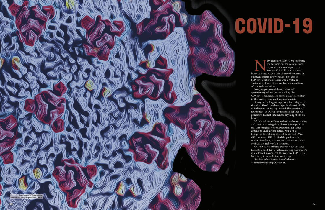
Scotlight Center Spread Pages 32-33; COVID-19 Introduction: Being the first spread that the public will see when reading the center spread, I found it necessary to highlight the dominant and eye-catching graphic I made to catch the readers' attention, as well as effectively introducing the content. When placing my COVID-19 graphic, I found it effective to have it span 3/4 of the spread while leaving room for a brief introduction to provide the readers with a stark visual contrast between art and text for easier content digestion. I also decided to invert the background color from white to black and text color from black to white to draw attention to the vivid colors of the graphic and headline, making the center spread color scheme more apparent.
Highlander May Issue 2020
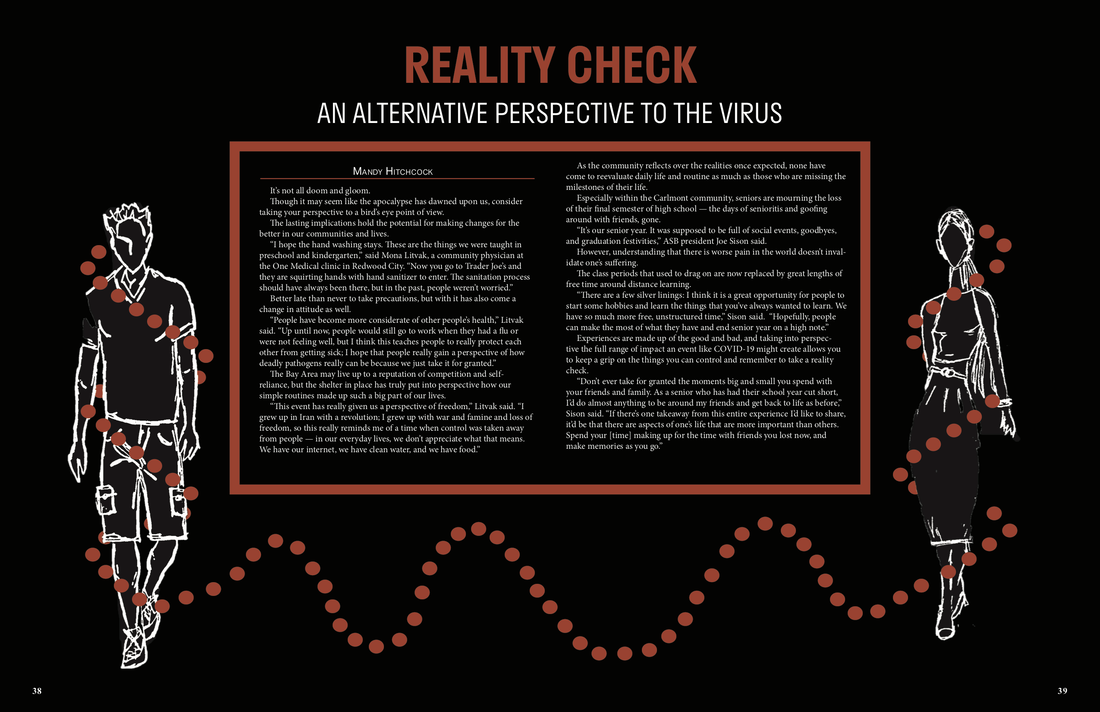
Scotlight Center Spread Pages 38-39; COVID-19 Reality Check: The article being about how COVID-19 is consuming the realities of individuals in modern society, I chose to make the design a physical representation of the control the virus has over humanity. In order to create a clean and more balanced look, I decided to break the magazine's style guide by centering the article and placing my drawn graphics on the sides of the spread to better frame the text and headlines. By choosing to invert the background and text colors from white to black, I showcased the consistent color scheme of my center spread while visually emphasizing the article's content (the severity of COVID-19) through the color orange that consumes the white graphics and text.
Highlander May Issue 2020
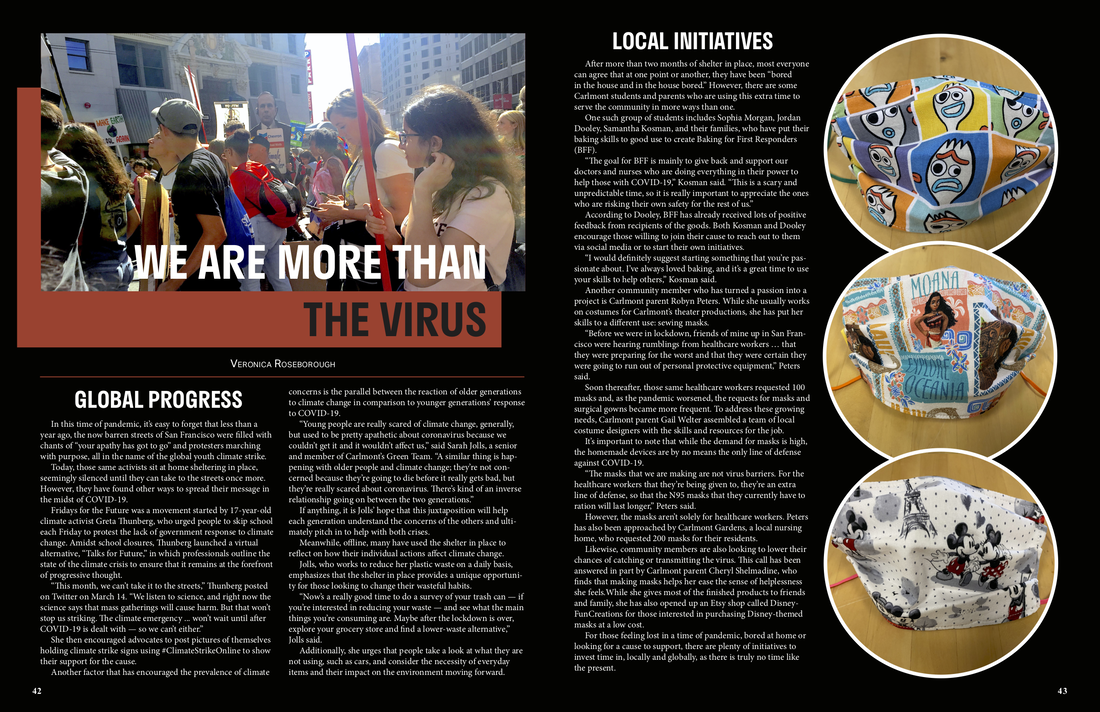
Scotlight Center Spread Pages 42-43; We are more than the virus: Being the last two pages of the COVID-19 center spread, I found it necessary to end the package in a clean manner by filling the last column with overlapping graphics that are relevant to the article instead of ending the spread with another column of dense body text. The article being about how COVID-19 should not define this period of our lives, I decided to showcase real people protesting and dedicating their lives to making change in the feature photo to personalize and localize the design. I also decided to invert the background color from white to black and text color from black to white to draw attention to the vivid colors of the graphic and headline, making the center spread color scheme more apparent.
Highlander March Issue 2020
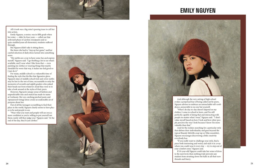
Scotlight Center Spread Pages 20-21; Fashion Profile on Emily Nguyen: This center spread being a fashion issue, I decided to break our magazine's style guide to better highlight the student's outfit and individuality showcased in the photos I took of her. By limiting the amount of body text in comparison to photo size, I was able to create a multidimensional page design that is easy for the readers to follow visually when digesting the content. I also decided to integrate a burnt orange color scheme to add to the cohesion of the design by pulling colors from the student's outfit and framing elements of the page in it.
Gentry June Issue 2019
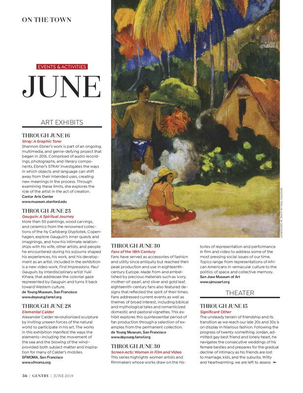
Gentry Magazine Page 56; June Event Calendar: Being that this calendar page is focused on art exhibits, I decided to use one of the art pieces given to me by a Gentry client as the feature photo as it is relevant to the content and offers a strong color scheme to base the page design off of. By choosing to frame the body text around the artwork, I made my page design be a physical representation of the article's content (framing a piece of artwork), while making the page easier for the readers to navigate. I also decided to pull the dominant color red from the artwork and embellished the page with red highlights to add some visual consistency to the page design.
